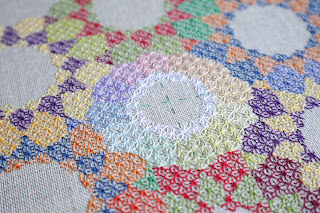
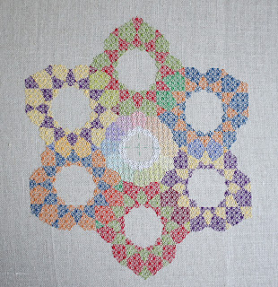
Since I posted the image of my ORT with all the colors, I figured I should share an update of my contrast color wheel.
Once the big blocks were completed, the smaller hue areas took next to no time to complete. It took more time to weave in the ends than it did stitching the areas.
I'm looking at the overall piece and I'm finding that blue-green color (the one between the green and dark blue) really jarring. I can't help but feel like I have a mistake... So I reached out to Jen Goodwin and she confirmed that there is a problem. I'm waiting to hear back from her again, but there will definitely be some unpicking in my future. For now, it's all the light green in the top block and lower block (where the red is the dominant color), as well as the weird blue-green blocks.


I agree that the blue-green jars a bit - but the rest is looking good, and I'm sure you will soon have a solution!
ReplyDeleteI agree, that green looks a little...off. Hope you can figure it out soon. For now, I think I still like the pastels in the middle best!
ReplyDeleteI agree, there is definitely an issue with that colour. It really stands out in a way the other connecting petals don't.
ReplyDelete