If you've been following along for a while, you know color is my weak point. This piece was actually supposed to be treated as an etude and I wasn't planning on spending too much time thinking of color. Just use whatever is suggested by the JEC and be done with it. Here are where the problems start, there are two versions of Himotaba: a standard one and an extended version.

I don't know about you but I find that stubby tassel really ugly, so I went with the extended version. More stitching to do but it will be worth it as the design feels more balanced. You'll notice that the extended version doesn't have a colored image even, thought they do have a suggested list of silks for it. I looked at the colors and it looked nice enough. Many of the colors are even used in Hiogi and my version of Eternal Grace, so I figured why not. Until I received the silks.
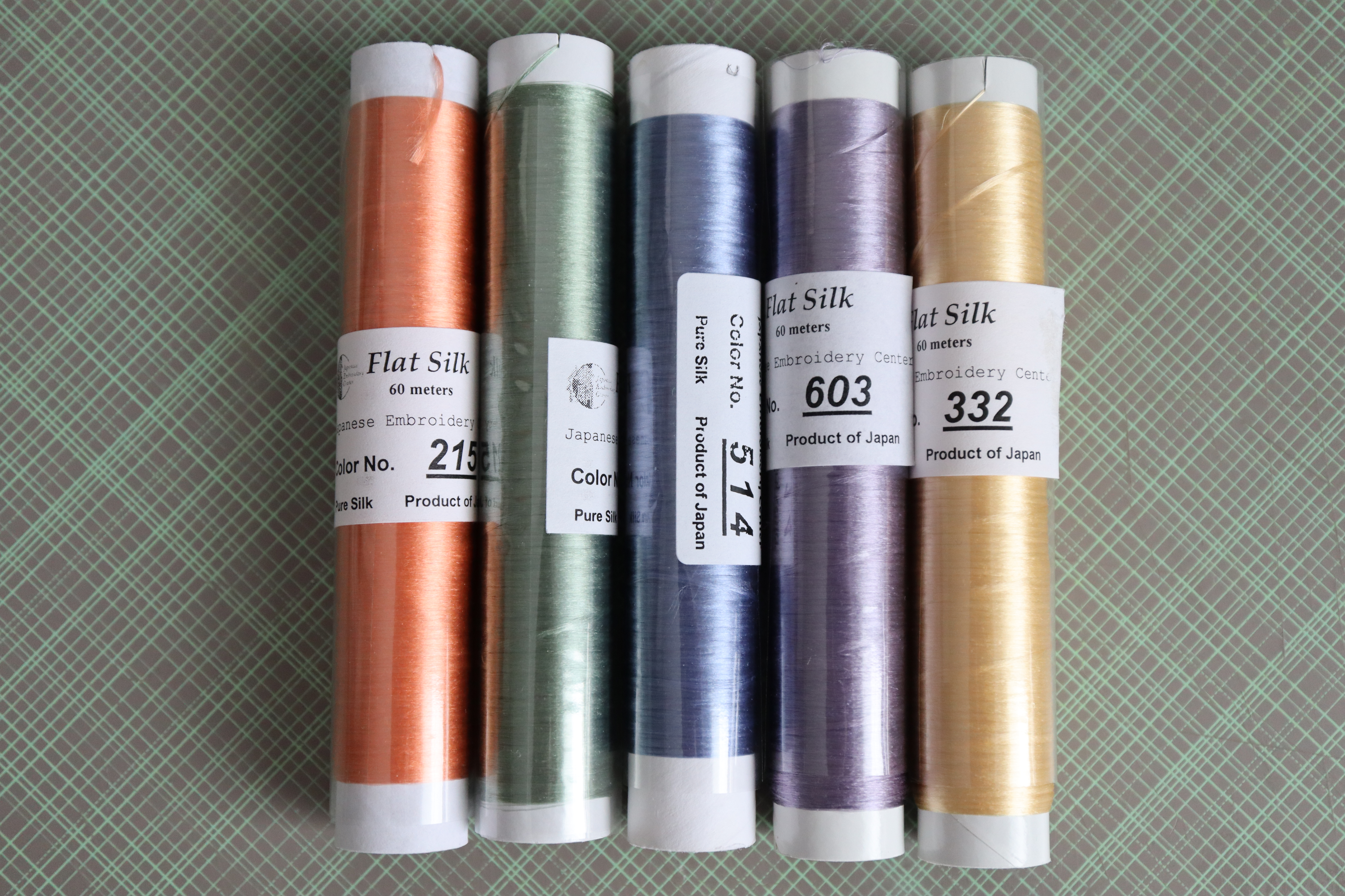
Although the colors look nice individually, once you put them together... my biggest issue is that orange. It's way too light, considering it's used for three cords. Place it next to the green and it becomes muddy. Then started my nightmare of having to pick colors

As you can see from the animation, I went through several iterations. Using my tablet to color the cords really helped me out in trying to visualize how it would look. There were a few conditions I needed to follow when picking colors:
- I needed two contrasting colors to make a transition (3rd cord from the top), usually from dark to light
- I needed another color transition, this time silk to metal (last cord)
- the rein effect cord (2nd to last cord) is usually done in red over a foundation of couched gold. This could also be a foundation of couched silver and a different color would then be selected
- this was a recommendation from my teacher: don't use too many colors as it will make the piece too busy. The original has five silk colors, plus gold. It's best not to go over that and in fact it would actually look nicer with less colors and instead use different shades.
In my first iteration I took the main colors from Hiogi that I liked: red, pink, white, green, blue and purple. In the end, the only colors that survived is the red and pink which I had used in the pink cloud and cherry blossom on Hiogi.

I was initially going to also use the same white, but it was a little too bright for the piece. I swapped it for a creamy/pinky white. I wanted green in there and after a lot of back and fourth, decided to use the same greens as my Grace's kimono.

So I finally had my color palette, with the original as a backup. However, I wouldn't know until I actually started stitching whether the colors would go well together or not. It will depend on whether the silk is flat or twisted, am I combining it with metal thread, what cord will it be used for, what color will be next to it... It would just have to be a trial and error.


As all this happened over a month ago, I can confirm that the colors did play nicely together. I'll show you in the next post.
It''s going to be beautiful after all you went through to find the right colors. Looking forward to seeing the results.
ReplyDeleteOh my. I've had similar challenges, and until you get everything to work nicely there is always the sensation of wandering lost in head-high vegetation, with no sense of progress. Exasperating.
ReplyDeleteIt's very good to know you got there in the end!
I'm not good at picking colours either, but I think you did well and I'm looking forward to see them in play!
ReplyDelete